
What’s in a Name?
“Flag 5…huh? What does that even mean?!”

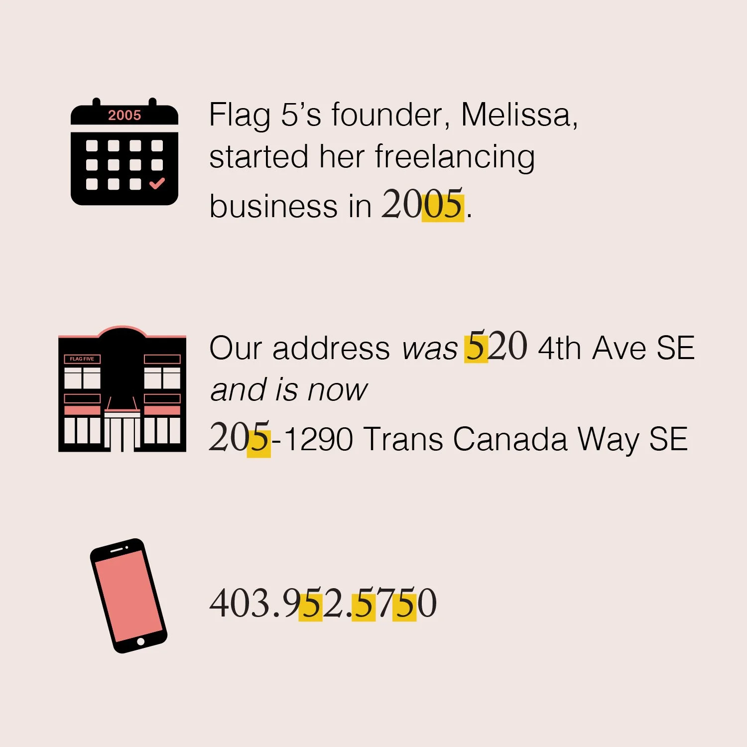
Picture it, the year is 2016, and a business called Type Designs was operating in Medicine Hat, AB. They created logos and brands as one of their services. But guess what they lacked? A solid brand (*insert gasp). No matter how hard they worked on their brand it just didn’t feel right. They decided to work with a brand strategist to come up with a name that was more fitting to the services they provided. Then, sometime later, Flag 5 was born.
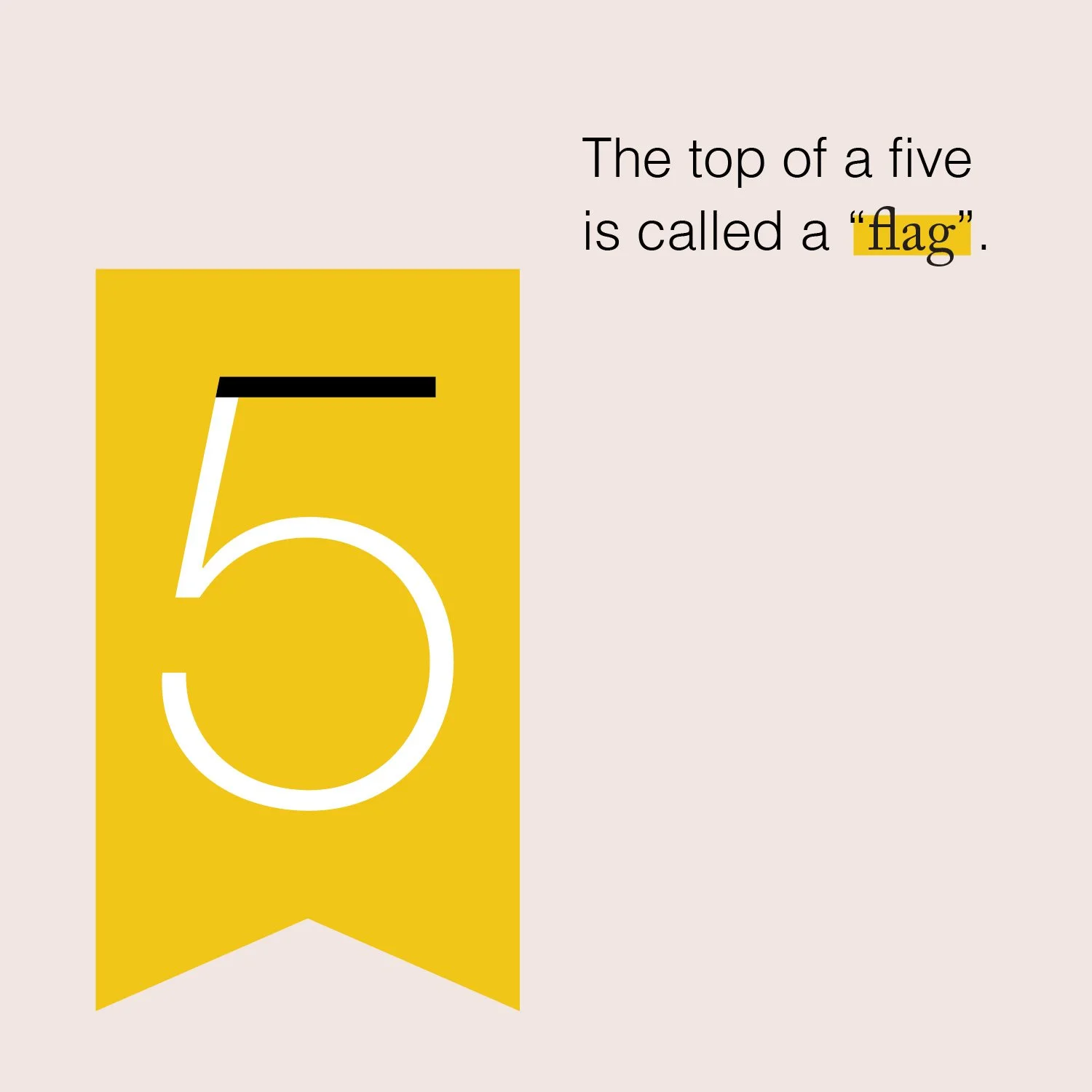
You might ask, “What is Flag 5?”. Flag 5 is a graphic design studio that specializes in visual communications. A flag is a universal tool for signaling and identification, especially in environments where communication is challenging. We create graphics for businesses that help them look professional and stand out against their competition. So the word “flag” was very fitting and depicted exactly what we do and it just felt right. We also love minimalism and believe “less is more”, which we now use as our motto.
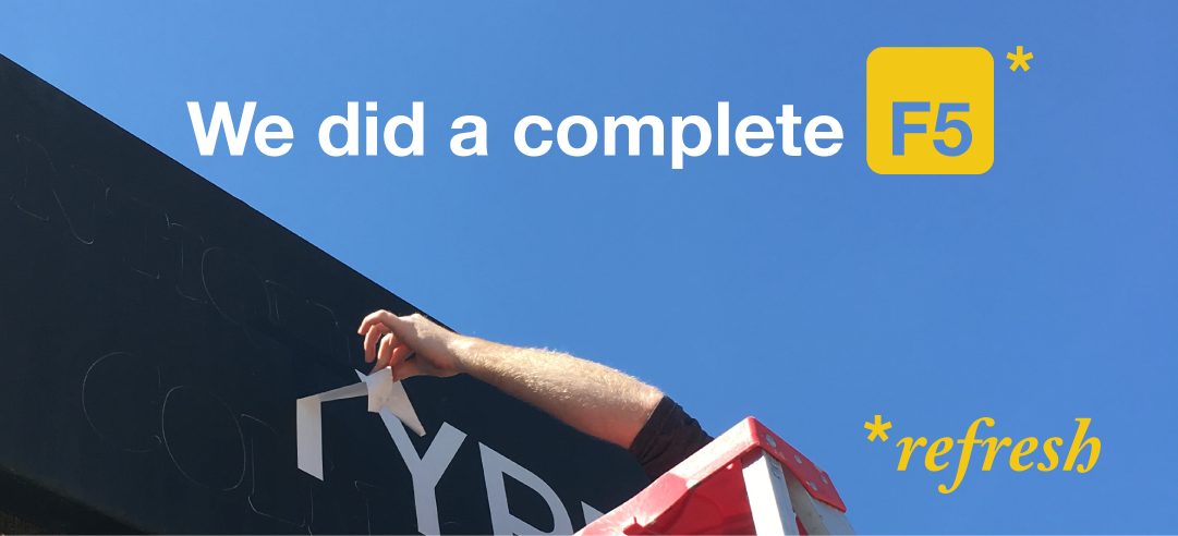
Once the word Flag was solidified another word was needed to complete it. After a list of options, the word five was brought up. Five was a significant number to us without us fully realizing it. It was the year Melissa started her freelance business, we were operating out of our space for the last five years, and a bunch of other synchronicities of the number 5 surrounded us. As well, a service we provide clients is rebranding. The function key “F5” means to refresh. So Flag 5 it was! We created a teaser campaign to relaunch our brand. The response was great and we are so happy with our brand name.
“F5” Teaser Campaign Graphics

A visual representation of Flag 5’s reasoning.
While we were only a part of the process when the brand name Flag 5 was created, we have helped name multiple brands throughout the years. There is so much thought, reasoning, and time that goes into a brand name. Check out five examples below of names we’ve assisted with. Each one was presented to clients with multiple options, mood boards of how the visuals could look, and in-depth reasoning behind each. It’s so fun to watch the process unfold and work with amazing organizations and businesses that surround us. We have another one launching in March…so be on the lookout for it!

Flag Five alongside Evoke Inspired Marketing worked with each organization shown above to name and rebrand their business/organization (minus Terrain Earthworks).
Stay tuned for our next blog where we chat about the creation of Flag Five’s visual identity and the importance of a brand that is consistent!