
Purposeful Branding
“Everything’s intentional. It’s just filling in the dots.” David Byrne
At Flag 5, we follow the philosophy that everything happens for a reason—and this includes the designs we create for our clients. Our goal is to give every design an intentional purpose and meaning. For example, when we approach our own branding, the Flag 5 identity, each individual decision has been carefully considered. So you can rest assured that your project will receive the same consideration and attention to detail.
Read on to learn about how the visual identity for Flag 5 was created…
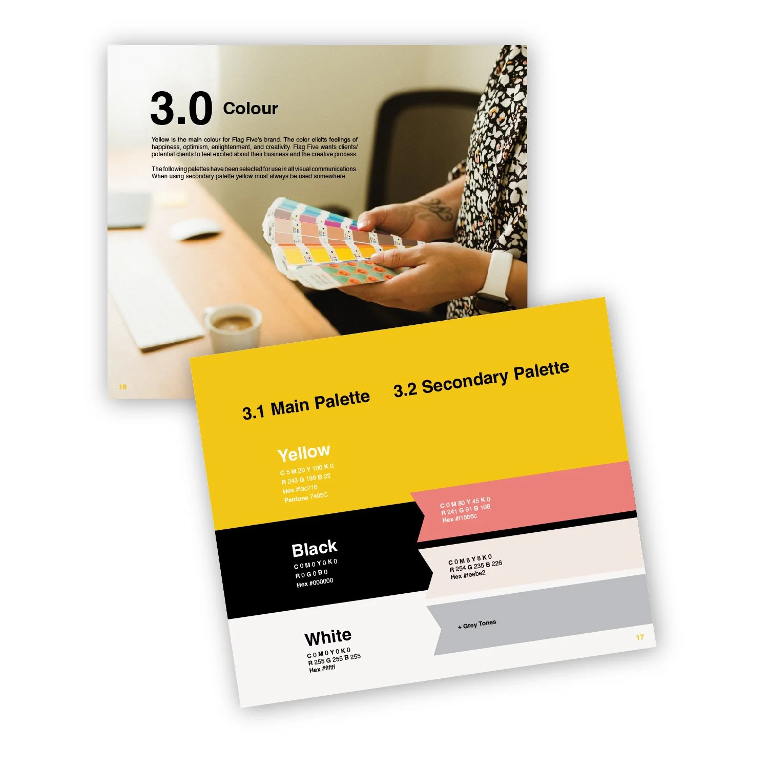
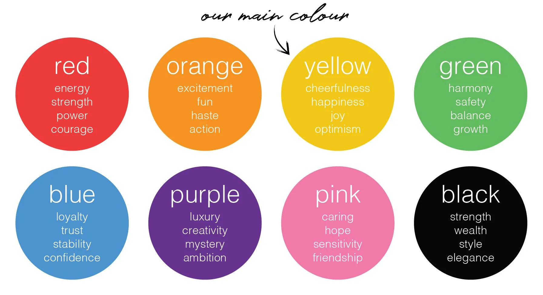
Colour - We are consistently conscious of how colour psychology can affect people's perceptions and behaviours. That is why yellow was chosen as our main brand colour; it is creative, positive, cheerful and warm--the exact emotion we want clients to feel when they work with us! Keep your target market in mind and how you want them to feel when they see your brand.
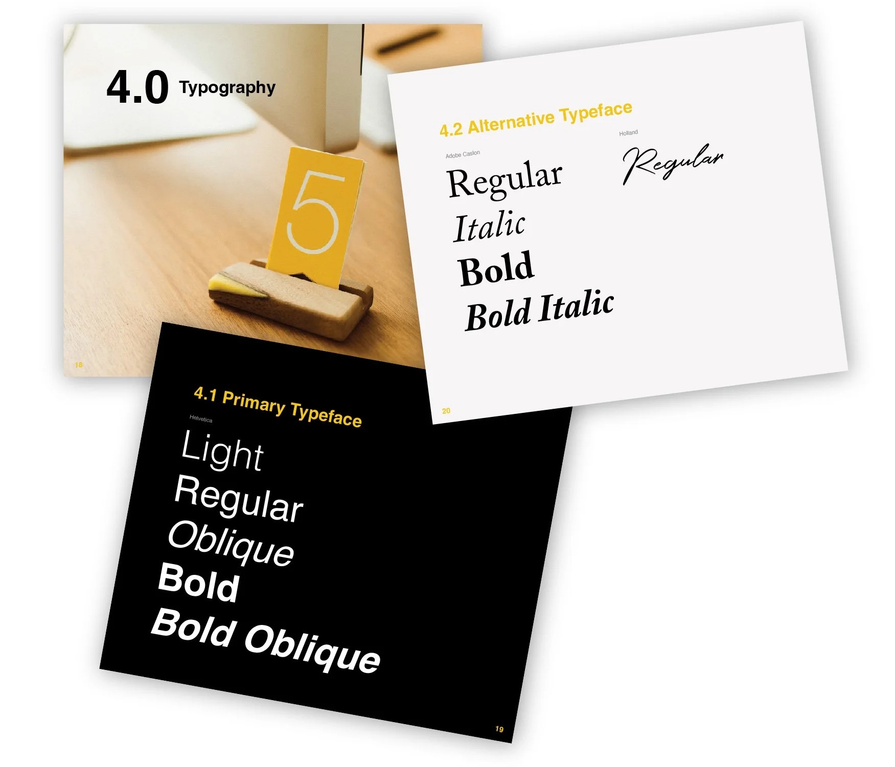
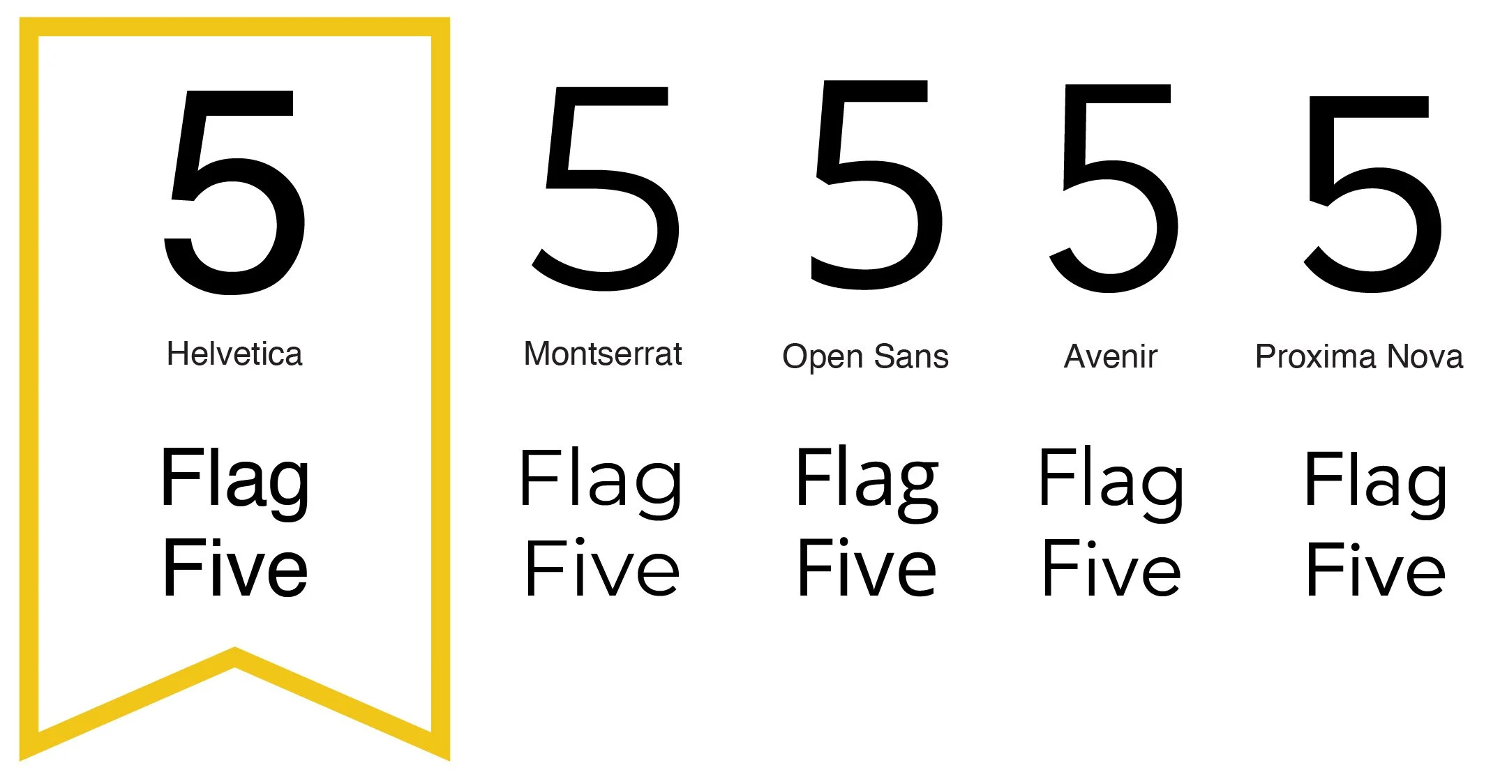
Typography - There are probably a billion fonts online but when it comes to choosing timeless, appropriate fonts for your brand it gets narrowed down quite quickly. We wanted to ensure the fonts we chose were appropriate to our target market (business owners ages 30-55) and not too playful. While we are a creative studio we wanted everything to be minimal and clean.
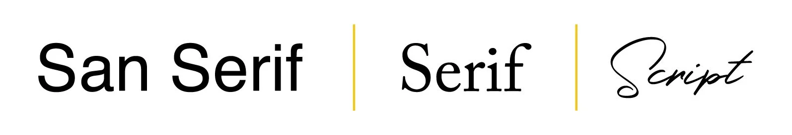
There are different styles of fonts (ex: San Serif, Serif, Slab Serif, Script). We use a san serif font as our primary typeface and have two alternative typefaces. We consistently use these fonts for all of our marketing & promotions.
Our main font is Helvetica. For graphic designers, it’s either appreciated or viewed as overused. Personally, we think Helvetica is one of the most well-designed fonts out there. The shape of the letters, numbers, and symbols are legible and have appealing clean lines. For reference, here's a comparison between several sans-serif fonts.
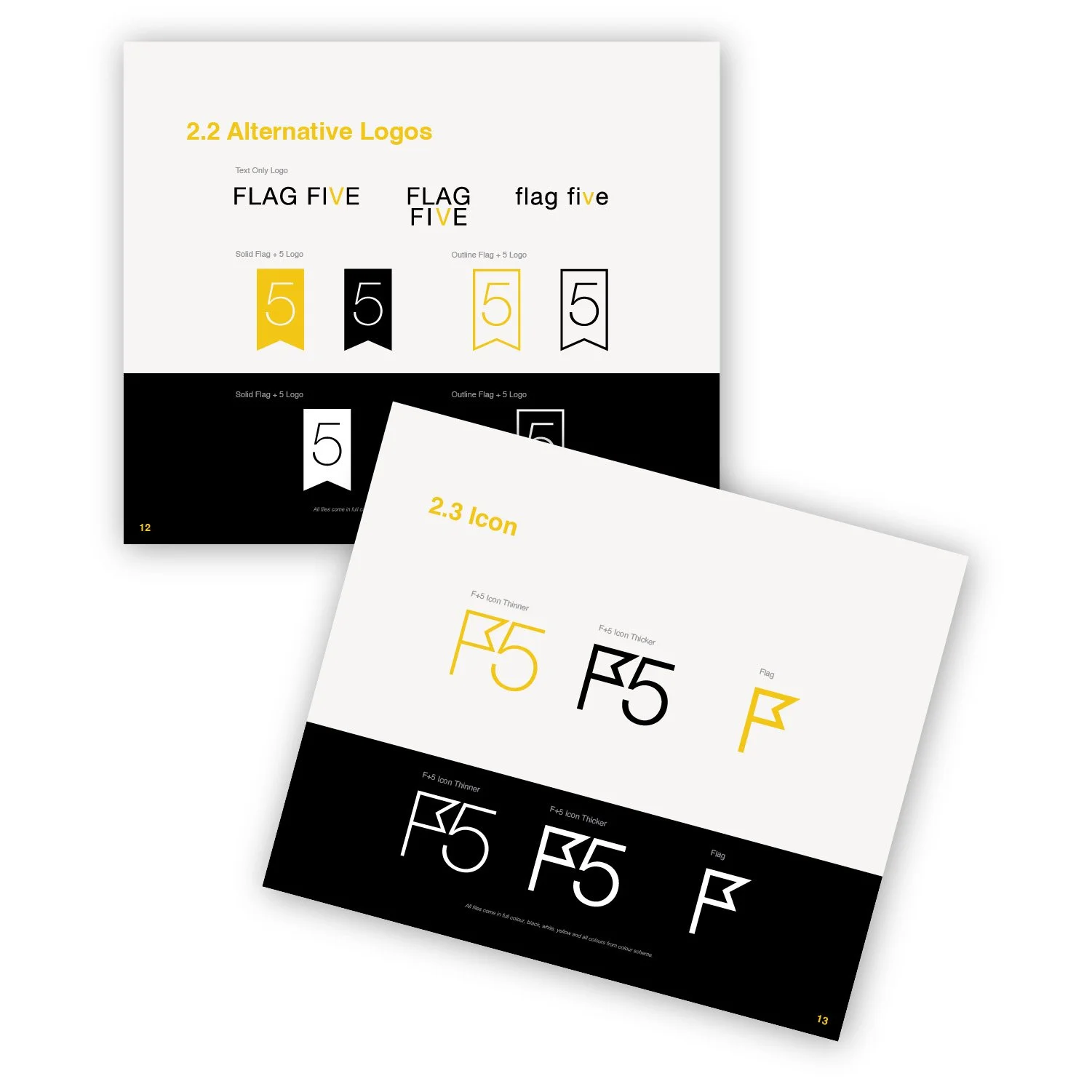
Logo Variations - Our motto is less is more but when it comes to your logo/icons we believe more is more. Having multiple versions of a logo is important. We strive to ensure all variations have consistent elements and design, while also being creative and exploring different orientations to better hone the details of the logo. Attention to detail is critical for creating a successful visual brand. Focusing on small details can take a logo from good to great, and ensure an impressive, visually pleasing result.
We wanted our icon to be easily recognizable and simple so in our final designs, we took the letter “F” and made it into a simple flag graphic.
We follow 5 basic logo design principles for every logo we create.
Simple - It is important to keep the design uncluttered and orderly as too much complexity can lead to confusion.
Memorable - You want the visuals to be in the mind of your audience no matter where they see it (ex: billboard, social media, advertisement).
Timeless - Use classic and timeless fonts/colors to remain relevant over the years. This allows for greater longevity of the design.
Versatile - Ensure the logo can be placed in any location, regardless of size or media type.
Appropriate - Choosing the right design elements is essential for engaging with a target market.
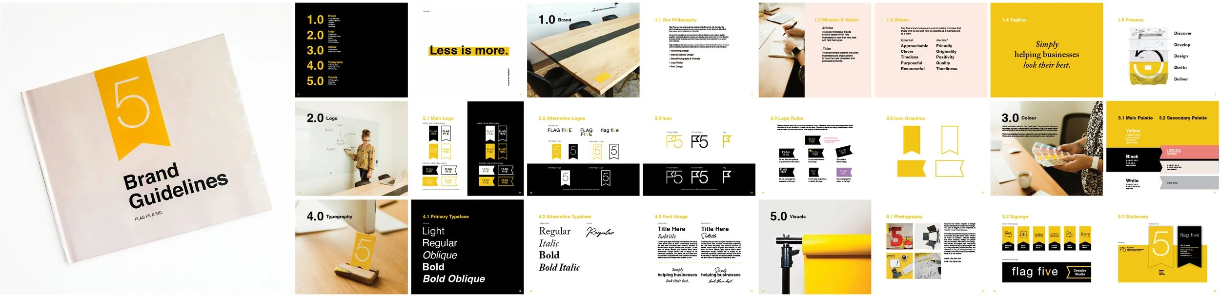
Brand Guidelines - A “style guide” or brand guide is essential for promoting brand consistency. It ensures that everyone who works with the brand follows specific standards, from colors and fonts to messaging and visuals. This allows a company to remain unified throughout its various marketing materials.

Mood Boards - Creating a mood board or brand board at the beginning of your brand process can be a great way to start forming a visual representation of what you want the end result to look like. While never copying any existing design ideas, it's still beneficial to view them for inspiration and direction. Having that vision in place will help ensure the final product is exactly what you're looking for.
On the right you can see a mood board for our first website design and a mood board when we were updating our studio space.
Take a look at some of Flag 5’s brand assets.

Die Cut Business Card

Packaging Label

Office Signage

Mailing Envelope
Final notes:
A brand is more than just a logo. Having a brand strategy is key and helps answer some of the questions you will need to answer when building your visual brand. If your business is looking to create a strong, lasting brand, you'll want to make sure it's consistent and purposeful. Here are 5 points that can help you achieve the desired result:
1. Defining your audience, what your brand is, and what it stands for (Vision, Mission, Goals, etc.).
2. Determining your unique selling point.
3. Incorporate your values.
4. Creating a visual identity that accurately reflects your brand.
5. Keep your messaging and visuals consistent!
If you're looking to create innovative ideas for your business or your brand, then look out for our upcoming blog. We'll be discussing the basics of brainstorming and exploring how to utilize it for creative, successful solutions. Don't miss out!